main menu redesign
Word by Word: Adventure » Devlog
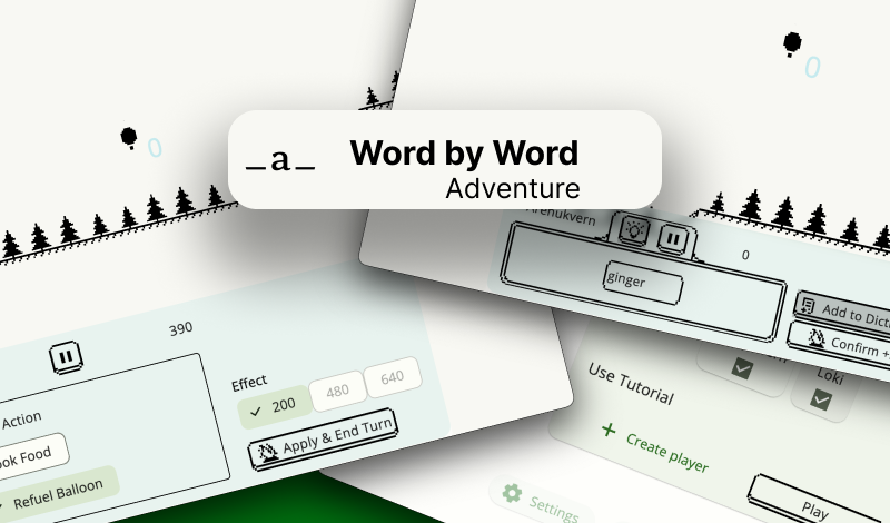
Recently, I thought about the feedback I received from ChatGPT and came up with the idea to redesign the menu to make it visually more pleasant and understandable.
Now there will be a separation by screens, and I also brought back the scrollable list to make it easier to navigate.
Animations are currently broken, will fix them in next iteration. But - in my opinion it starting to look like a game menu :)
Word by Word: Adventure
Write Words to Fly on Hot Air Balloon🏔️
| Status | In development |
| Author | arenukvern |
| Genre | Educational |
| Tags | Arcade, Multiplayer, offline, Pixel Art, Short, Singleplayer, Word game, words-per-minute, wordy |
| Languages | English, Italian, Russian |
| Accessibility | Interactive tutorial |
More posts
- menu keyboard controlsSep 23, 2024
- pixel drawer experimentSep 21, 2024
- menu | ai challenge | weekly updateSep 16, 2024
- unexpected snowtime ⛄️ shader😃Sep 12, 2024
- studying shaders progressSep 11, 2024
- menu: continue game buttonsSep 04, 2024
- points animationSep 01, 2024
- focusable object clickingAug 22, 2024
- weekly update (technologies)Aug 19, 2024
- adventure menu redesignAug 11, 2024

Leave a comment
Log in with itch.io to leave a comment.