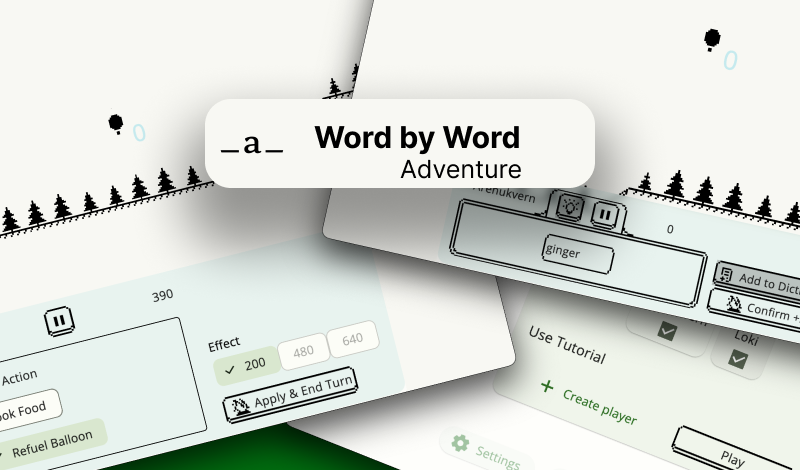
menu keyboard controls
- completed the main menu for the near future + now it can be navigated entirely with the keyboard.
- finished the dialog window for switching languages.
- slightly styled the dialog with players and their high scores.
Side effects (which were actually the goal of the redesign:))
- settled on a color palette.
- prepared a mega button for handling focus state, mouse hover, and invoke action
- for example, when pressing space or enter, added tooltips, and added animation for the focused icon (either an arrow on the left or an icon). - refactored the indentation.
- prepared the structure for working with Focus and actions in dialogs and on screens.
- The close icon or cross or close button turned out to have a different meaning - it's the X key on the keyboard! I used it without thinking in games, but I had never seen such an implementation on websites. It’s actually quite convenient to think about.
- studied game experiences
- I thought, since it's a word game, all actions in the game should be fully accessible without a mouse, only with the keyboard - this is an additional goal that will now 100% influence UX and UI, as some decisions that were not obvious suddenly became simpler when focusing was necessary. Well, simpler - still a ton of research and iterations :) but overall ✨🙌
Open questions for the future:
- The font style for the game title and its placement.
- Icons - should we go for pixel art or keep them vector-based?
Get World by Word: Adventure
World by Word: Adventure
write words to Fly on Hot Air Balloon🏔️
| Status | In development |
| Author | arenukvern |
| Genre | Educational |
| Tags | Arcade, Multiplayer, offline, Pixel Art, Short, Singleplayer, Word game, words-per-minute, wordy |
| Languages | English, Italian, Russian |
| Accessibility | Interactive tutorial |
More posts
- steam page + update!45 days ago
- pixel drawer experimentSep 21, 2024
- menu | ai challenge | weekly updateSep 16, 2024
- unexpected snowtime ⛄️ shader😃Sep 12, 2024
- studying shaders progressSep 11, 2024
- menu: continue game buttonsSep 04, 2024
- points animationSep 01, 2024
- focusable object clickingAug 22, 2024
- weekly update (technologies)Aug 19, 2024

Leave a comment
Log in with itch.io to leave a comment.