weekly update (technologies)


Throughout the week, there was very little time to work, but here’s what I managed to do:
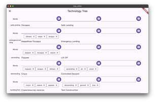
1 - Redesigned the technology editing in the editor (the screenshot looks similar to a table).
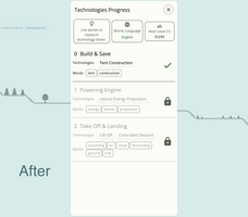
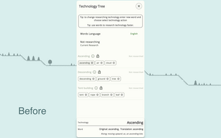
2 - Started reworking the technology dialog to make it more level-like and easier to navigate, showing which levels are already available and which technologies will appear in the future. I will redo it a hundred more times, but I feel like I'm heading in the right direction.
3 - Completed the level-up process when entering words; in the level dialog, I added/grouped information into cards - initially, I planned to do it in a line, but I accidentally tried it in a card format, and it seems clearer.
4 - Made inactive levels appear faded to emphasize their inactive status even more.
Word by Word: Adventure
Write Words to Fly on Hot Air Balloon🏔️
| Status | In development |
| Author | arenukvern |
| Genre | Educational |
| Tags | Arcade, Multiplayer, offline, Pixel Art, Short, Singleplayer, Word game, words-per-minute, wordy |
| Languages | English, Italian, Russian |
| Accessibility | Interactive tutorial |
More posts
- menu keyboard controlsSep 23, 2024
- pixel drawer experimentSep 21, 2024
- menu | ai challenge | weekly updateSep 16, 2024
- unexpected snowtime ⛄️ shader😃Sep 12, 2024
- studying shaders progressSep 11, 2024
- menu: continue game buttonsSep 04, 2024
- points animationSep 01, 2024
- focusable object clickingAug 22, 2024
- adventure menu redesignAug 11, 2024

Leave a comment
Log in with itch.io to leave a comment.