World by Word: Adventure
GUI Layout Changes
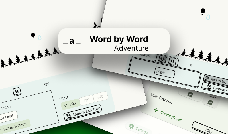
It seems that the interface has become more confusing.) The main idea was to make it more compact, but visually highlight the buttons that need to be pressed at a certain stage of the game.
For example, now it says "Phase: Enter Word" or "Phase: Select Action" above the field. This is important because it helps the player remember what they need to do in the current moment. Consequently, this may make it easier for the player to enter the game logic. Hypothetically... Additionally, during the word input stage, I have highlighted the button at the bottom of the panel which called "Word Inspirer". This used to be the "Word Suggestions" button, which is important for the player to easily find and click on to look for an answer - from which word to start the game or continue the word.
I have also placed the "Confirm" button on the right side. This makes it easier to end the stage, as pressing the button was previously too far up and caused annoying feeling. Although while writing this, I came up with another combination that may be even more convenient. Further experimentation is needed xD
Get World by Word: Adventure
World by Word: Adventure
write words to Fly on Hot Air Balloon🏔️
| Status | In development |
| Author | arenukvern |
| Genre | Educational |
| Tags | Arcade, Multiplayer, offline, Pixel Art, Short, Singleplayer, Word game, words-per-minute, wordy |
| Languages | English, Italian, Russian |
| Accessibility | Interactive tutorial |
More posts
- steam page + update!45 days ago
- menu keyboard controlsSep 23, 2024
- pixel drawer experimentSep 21, 2024
- menu | ai challenge | weekly updateSep 16, 2024
- unexpected snowtime ⛄️ shader😃Sep 12, 2024
- studying shaders progressSep 11, 2024
- menu: continue game buttonsSep 04, 2024
- points animationSep 01, 2024
- focusable object clickingAug 22, 2024
- weekly update (technologies)Aug 19, 2024
Leave a comment
Log in with itch.io to leave a comment.